Probably the simplest rule used in composition is the rule of thirds. The word rule is not strictly helpful of course since it isn’t a rule, but more of a “guideline”. “Guideline of thirds” isn’t as snappy a name though so we’ll stick with the “rule” of thirds. Essentially it has been observed that when you put the subject of your picture in the centre of the frame, it doesn’t look as nice as when you place it on the intersection of the “thirds” lines on the rectangular frame; this is why so many cameras give you a “view” option that shows the “thirds lines” on screen to help with composition.
.jpg)
(This was a macro of my Panasonic LX3 screen taken with a Canon Ixus 850 compact, the lines should really be straight but what you are seeing is “barrel distortion“)
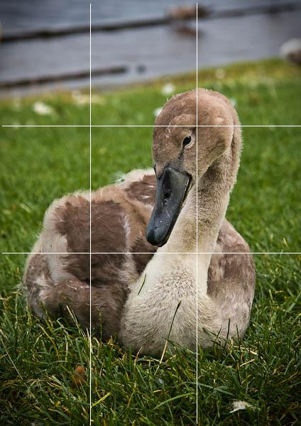
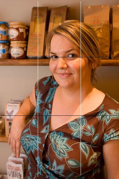
The idea is that with or without the lines on screen, placing the main subject on one of these lines maximises your chances of creating a pleasing composition. The lines are only guides, and with even a little practice you will probably turn the guides off again as they will be “in your head” so quickly. You don’t have to use them precisely, just roughly placing the subject near an intersection improves a composition in most cases. Here are some examples:
.jpg)
Notice how close its head is to the thirds intersection.

Again, the eye being the main focal point being placed instinctively on the thirds looks great.
.jpg)
This one is a little off the thirds, but even being close to the intersection is a decent composition.
.jpg)
Bang on the thirds this time and it works.

Here, Gillian is slightly off-centre and her eyes (the focal point in a portrait) are close to the thirds lines. Portraits are an interesting exception however in that they can frequently work with the subject centred. That said, rule of thirds usually gives the best portraits.
Here’s one of me that someone took about a decade ago, notice how boring the centre composition is to the eye? (This is particularly a problem with landscape format pictures which have a lot of space either side of you centre the subject. Basically your eye wants to see the background as well as the subject, and the centre composition gets in the way and makes that difficult.)
.jpg)
Here’s one taken of my friend Gerry within a few minutes, but better composed in terms of “thirds”.
.jpg)
So in summary: Place the main subject, or the eyes of your portraits near or on the intersections of the lines that split your frame into equal thirds. Most times this will give you a reliable and pleasing composition. Remember however, that it isn’t a rule, you can break it if you feel like it. Some of the best photographers have incorporated rule-breaking into their style, but first you can bet they mastered the rules they later choose to break.


Excellent tutorial Matthew – nice and clear.
national pharmacies online prescription drugs shoppers drug mart pharmacy
ordering prescriptions from canada legally discount prescription drug canadian prescriptions
cialis pharmacy online herbals eye drop
viagra uk viagra pharmacy viagra without rx
canadian pharmacies without prescriptions 24 hour pharmacy best online pharmacy stores
viagra cheap online viagra en sydney buy viagra quick
canadian drug store pharmeasy best canadian online pharmacies
Brand Cialis 800 mg viagra canada medication pharmacy
payday advance seattle payday loan gainesville ga consumer protection agency payday loans
90 advance loan newport news payday loans can you get more than one payday loan florida
cialis online ohne rezept best pill cutter cialis il cialis scaduto funziona
viagra sales aurtarlia chesp viagra viagra in canada
payday loan with social security benefits gs cash advance texas payday car title loans